
CSS: Properties That You Probably Don't Know

Diving deeper into this world since 2020, focused on open-source development, writing my experiences and making what people wantDiving deeper into this world since 2020, focused on open-source development, writing my experiences and making what people want
Every year new CSS properties are standardized and made available in major browsers for you to use. They are meant to make the life of web developers like you easier and to allow the creation of new and beautiful designs. So, in this article, I'll cover some CSS properties that you probably don't know/use.
overflow-anchor
body {
  /* [ auto | none ] */
  overflow-anchor: none
}
Surely you already have started reading the page content, but it still loading, and suddenly...
The scroll moves and the page jumps!
It happens because images or other components loaded later. But you can avoid this behavior with this CSS property!
Note: Progressive enhancement is automatic in this case, which means that browsers that don't support this property will just ignore it, so you can use it without fear.
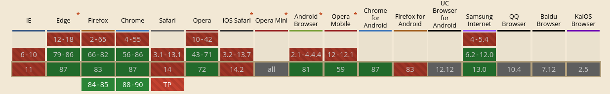
Browser support
@supports
/* It tests if the browser supports the `object-fit` */
@supports (object-fit: cover) {  }
/* If it doesn't support... */
@supports not (object-fit: cover) {  }
/* You can also write nested `@supports` */
@supports (display: grid) and (not (display: inline-grid)) {  }

@supports selector(A + B) {  }

@supports not selector(:is(a, b)) {  }

@supports (--primary-color: blue) {  }
It works like media queries, but it serves to test whether a certain feature is available or not in the browser.
Great for using news in CSS properties that are not present in all browsers, since we can provide fallbacks (with different treatment) if the browser doesn't give support.
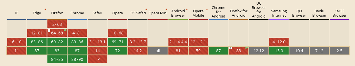
Browser support
clamp
div {
  /* clamp(min, value, max) */
  padding: clamp(20px, 10vw, 40px)
}

body {
  font-size: clamp(14px, 1vw + 10px, 18px)
}
This function allows you to create responsive elements and use fluid typography without relying on media queries if applied in association with the relative viewport units: vw andvh.
It is a considerable change in the way we think about layouts since it stops being based only on breakpoints, becoming more fluid and adapted for different resolutions.
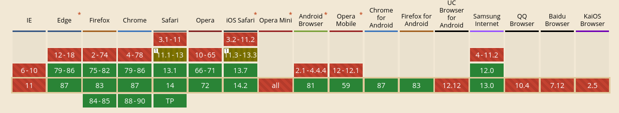
Browser support
Extra: masonry grid
.container {
  display: grid;
  gap: 10px;
  /* Define this layout with
    grid-template-columns or grid-template-rows
  */
  grid-template-columns: repeat(auto-fill, minmax(120px, 1fr));
  grid-template-rows: masonry;
}
Masonry layout, on the web, is when items of an uneven size are laid out such that there aren’t uneven gaps.
Pinterest is a good example of Mansory's layout.
If you want to see more about it, I recommend the MDN Web Docs
Browser support
⚠️ This feature is only implemented in Firefox, and can be enabled by setting the flag layout.css.grid-template-masonry-value.enabled to true
Thank you for reading this article! And if you want to be updated with the best content, subscribe to my newsletter and see you in the next one


